VEGAN LAO FOOD
AIM
The VLF logo is the face of the Vegan Lao Food brand and one of the key elements of the brand identity. Consistent use of the logo is essential to maintaining our identity, brand integrity and gaining instant recognition across all marketing channels and media.
OUTCOME
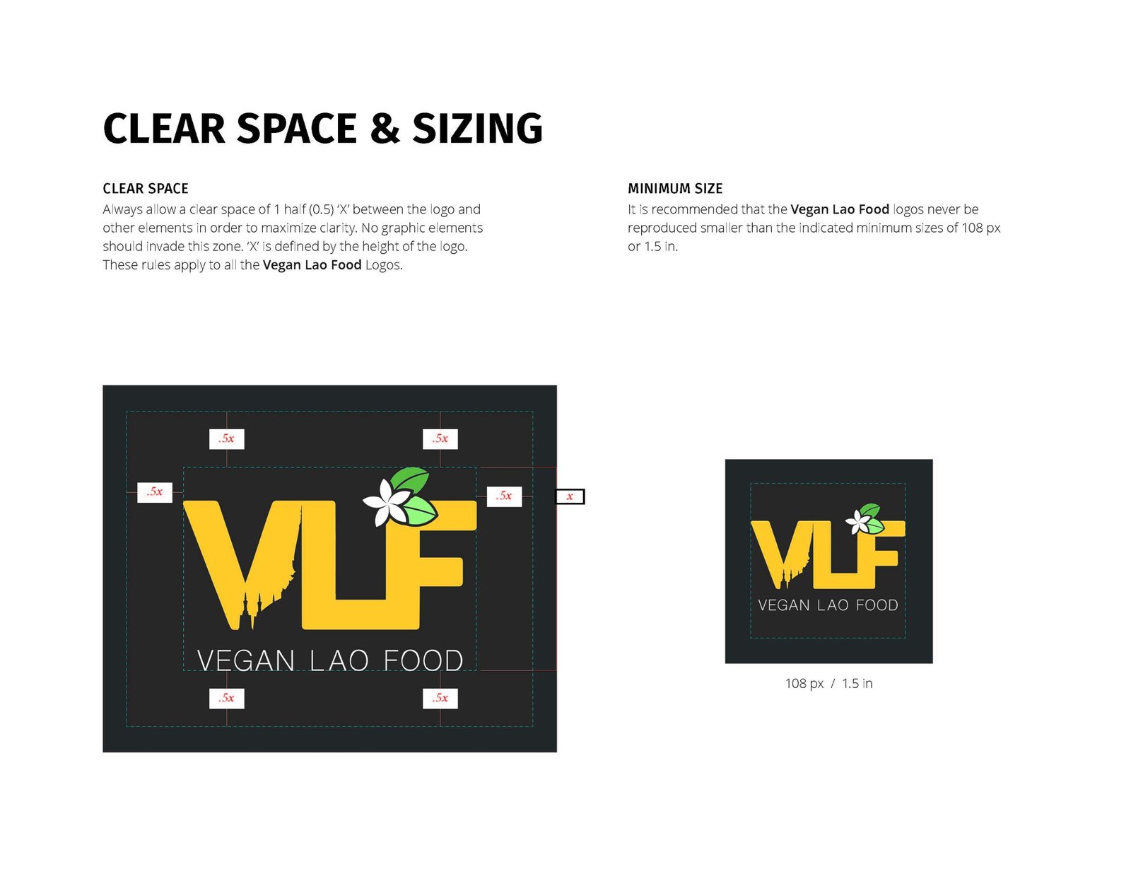
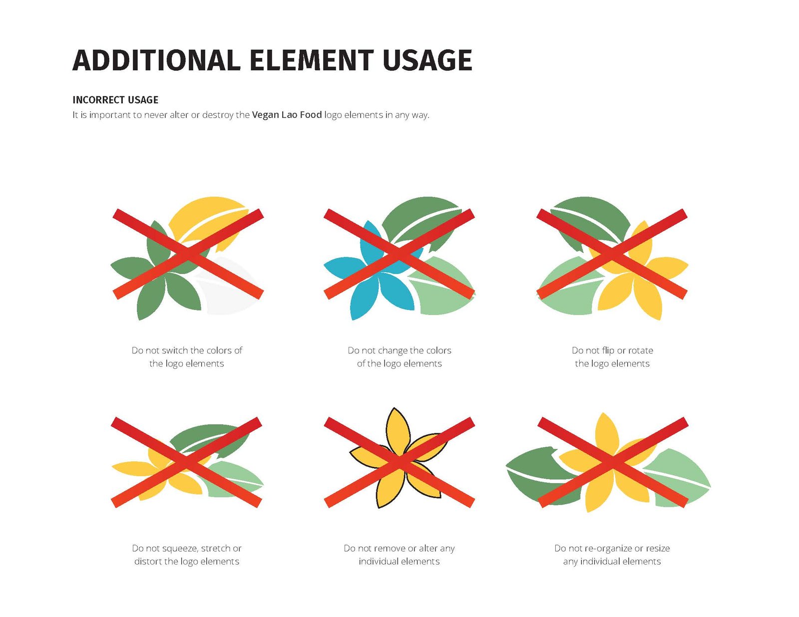
The Vegan Lao Food logo belongs to the family of Vegan Food Recipe brands. Because of this, we wanted to stay consistent with some of the other brands in the family of Vegan Food Recipes brands by having a cohesive look. However, due to conflicts regarding the flag(s) of Lao, we went a different direction with the Vegan Lao Food logo incorporating a silhoutte of the famous Lao landmark Pha That Luang in the negative space between the V and L. We were also inspired by its beautiful golden colors and wanted to implement those as well. The final piece that we implimented was the national flower of Laos, the dak champa.
SERVICES
• Graphic Design
• Brand Identity
• Logo Design
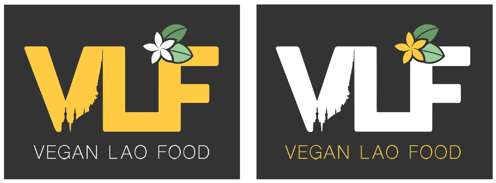
In the highly competitive realm of the International Branding, Logo Design, and Advertising Awards (IBLDAA) held in Fresno, California, I achieved notable success by securing the first place in the Branding & Logo Design category for Food. This prestigious recognition was awarded for the exceptional design of the brand and logo for the Food Empowerment Project’s initiative, Vegan Lao Food. My approach to this project was holistic, encompassing not just the creation of an award-winning logo but also addressing the broader branding requirements. I was responsible for the comprehensive creative design, including UI/UX, as well as digital and print materials. This achievement underscores my ability to translate campaign ideas into tangible, impactful designs that resonate with the target audience, fulfilling both aesthetic and functional design needs across various platforms.
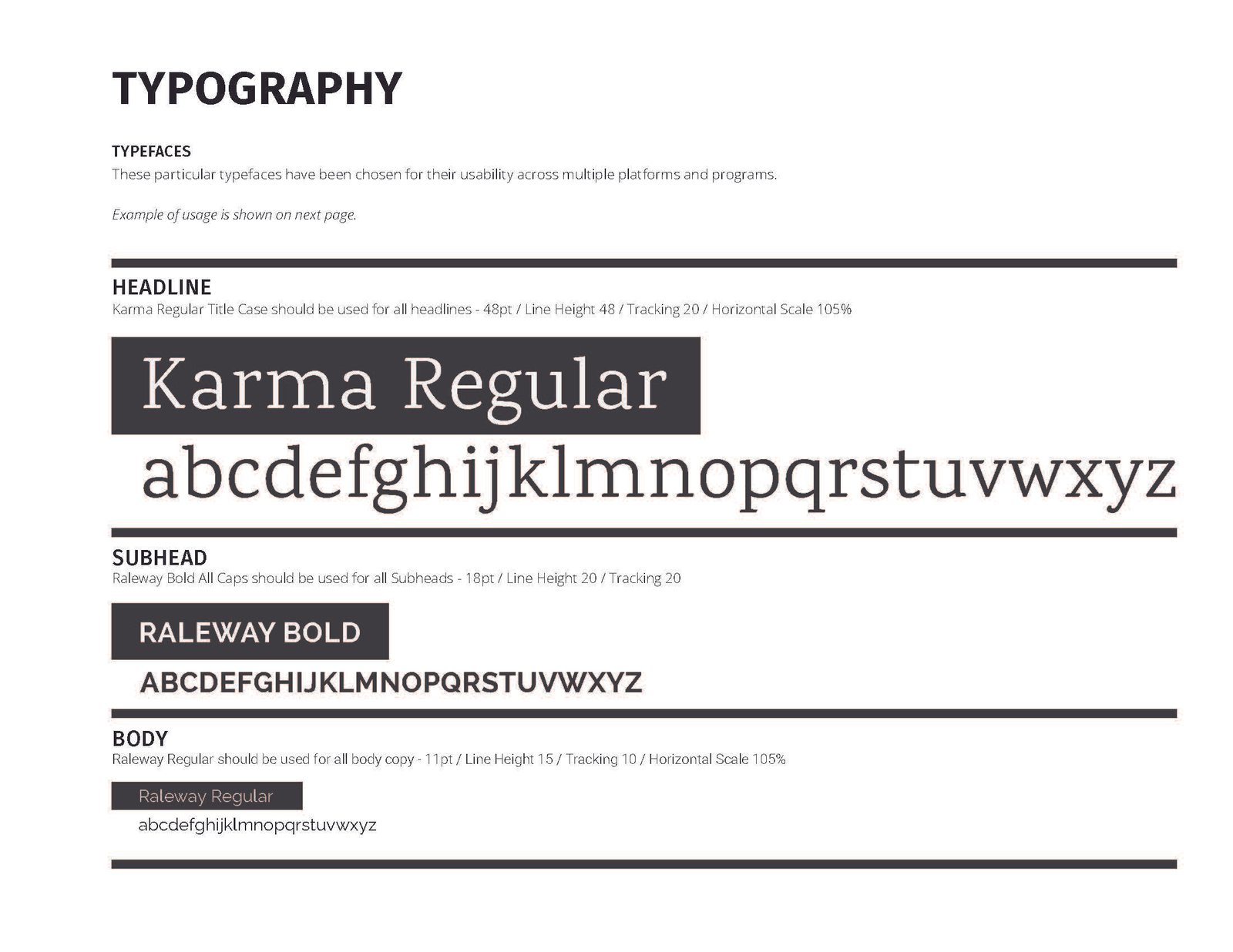
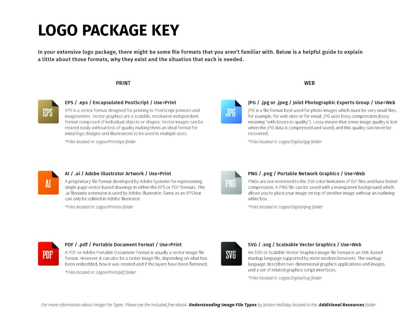
Brand Style Guide




Matching existing brands
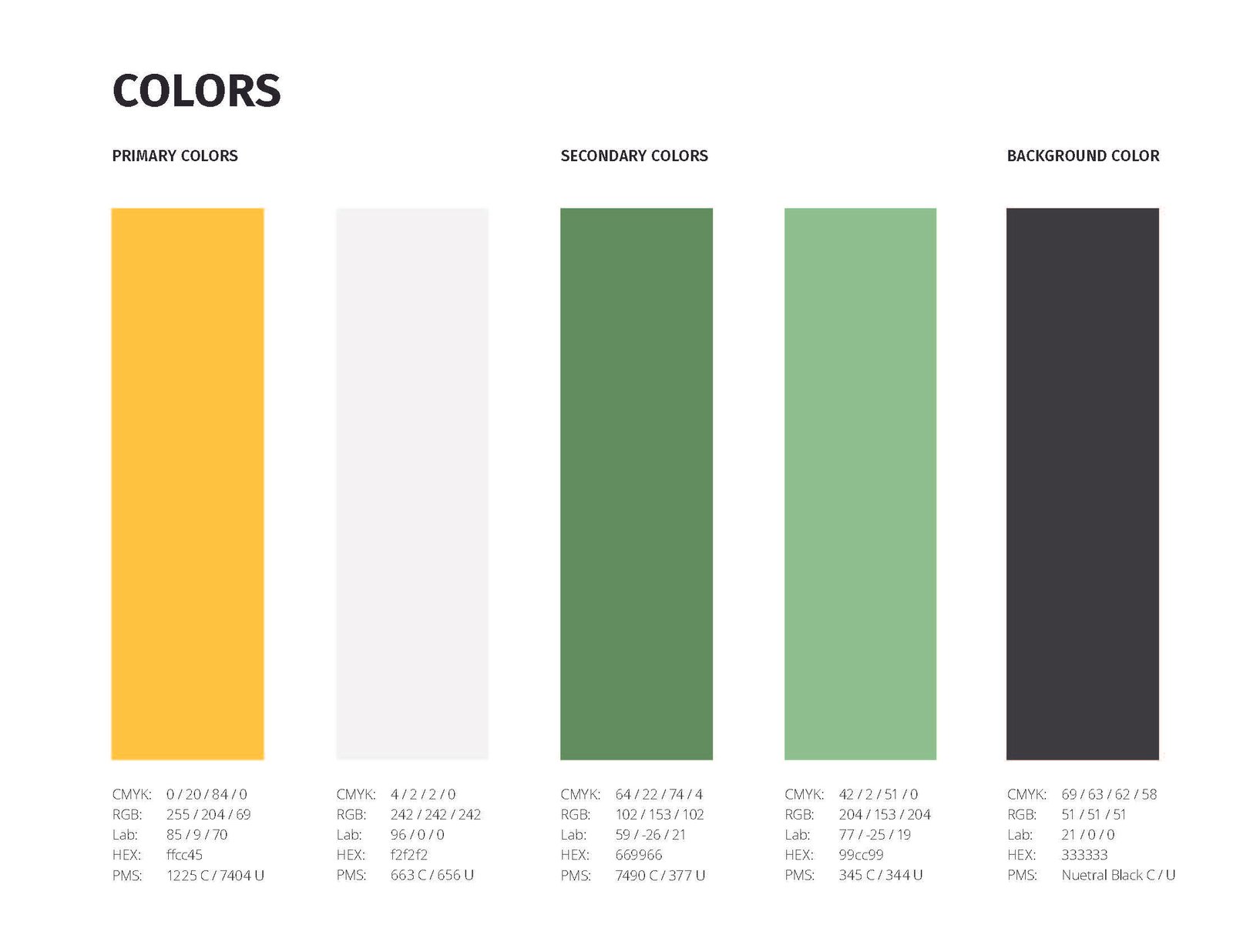
As a part of an existing brand family. We tried to match the feel of the other two brands. However, due to some issues around the flag of Laos. We decided to instead take a different approach with the overall style and colors while still staying true to the brand family of logos.
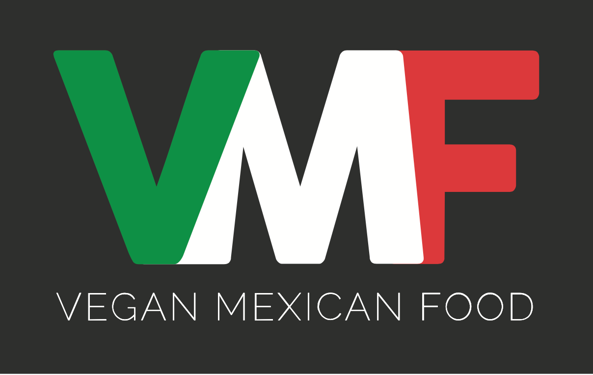
Vegan Mexican Food

Vegan Filipino Food
